
Hi, I'm Lauren Brannan!
Welcome to my portfolio!

About
My Background
B.S. in Geography &
Community and Regional Planning with
a Geographic Information Systems Certification
I am a recent graduate of Appalachian State University with degrees in Geography and Community and Regional Planning, along with a GIS certificate. During my time at Appalachian State, I worked on a variety of projects involving GIS, planning, and spatial analysis. I look forward to applying the knowledge and skills I’ve gained as I begin my professional career.I developed skills in spatial analysis, GIS, mapping, land use, environmental planning, and community development, with an emphasis on using geographic information to better understand and address real-world challenges.
_edited_p.png)

910-619-0780

Web Mapping

This is a custom Christmas-themed web map of Boone, North Carolina. The map uses vintage green and red accents, falling snow animations, and a snowy terrain to create a festive look while still showing the town layout and surrounding areas. The style focuses on being fun and seasonal without making the map hard to read, so roads and labels are kept simple and clean

This map uses different colors to show the GDP of countries around the world. Countries with higher GDP are shaded darker, and lower-GDP countries are lighter, so you can quickly see broad global economic patterns. It gives a simple visual way to compare countries without needing to look at a table or list of numbers.

This interactive map shows the planned route for a community bike riding event on Topsail Island to raise breast cancer awareness. It highlights the course path, water/rest stops, and nearby landmarks so riders can easily see where they’ll be going and what areas they’ll pass through. The map gives a clear overview of the event and helps people understand the layout of the island and path before participating.
Geographic Information Systems
 |  |  |
|---|---|---|
 |  |

Statistical Software with RStudio
 Latitude vs. Date of Last Spring FrostThis graph shows how latitude relates to when the last spring frost happens. As you move farther north, the frost tends to occur later in the year. You can see this because the points generally follow an upward direction, and the line highlights that overall trend. |  Salmon LengthsThis chart shows how long the salmon we measured were. Most of the fish were somewhere in the mid-50 to mid-60 centimeter range, with a few on the shorter or longer end. |  Stage vs. Discharge RelationshipThis graph shows how river height relates to how much water is moving through the channel. As the water level rises, the amount of flow rises too, which you can see from the upward pattern of the points. The line is there to show the general trend. |
|---|---|---|
 Home Values by NeighborhoodThis graph compares home prices in two neighborhoods. One area has prices that vary a lot more, while the other has prices that are more similar. It gives a quick way to see how different the two neighborhoods are. |  Environmental Factors and Frost TimingThese charts look at whether certain environmental features have anything to do with when the last spring frost happens. Some factors, like latitude and elevation, show clear patterns, while others don’t show much connection at all. |  Spectral Profile of Land Cover TypesThis graph compares vegetation, water, and urban surfaces based on how they reflect light. Vegetation stands out in certain wavelengths, water reflects very little, and urban surfaces fall somewhere in between. |

Cartographic
Design
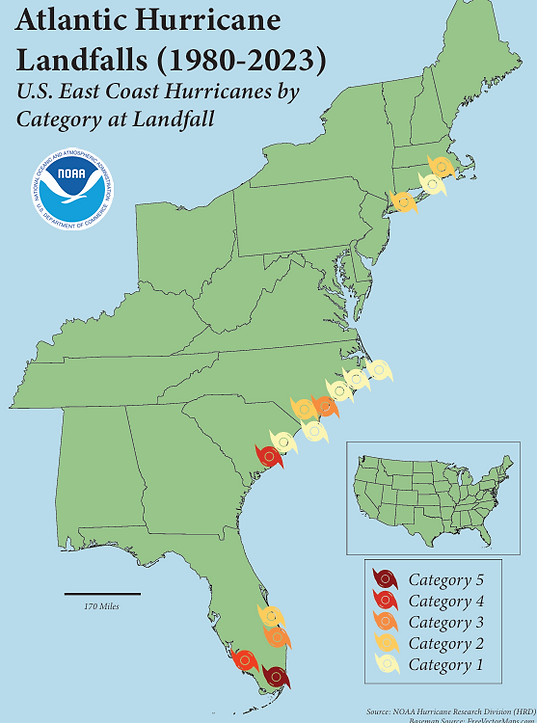
This map shows hurricane landfalls along the U.S. East Coast from 1980 to 2023 using NOAA hurricane data. Storms are symbolized by intensity at landfall, highlighting the higher frequency and severity of events in the Southeast compared to more moderate activity in northern regions.

StoryMap & Research Essay
Glacial Lake Outburst Flooding in Juneau, Alaska
Download Here
Environmental GIScience & Analysis
Download Here
Coastal Suitability Analysis for Oyster Reef Placement Along Topsail Island, North Carolina
